

Table of Contents
- Define Your Group's Purpose and Message
- Choose the Right Printing Method for Your Design
- Master Typography and Font Selection
- Apply Color Theory and Contrast for Maximum Impact
- Free Custom T-Shirt Design Software for Mac 2026
- Custom T-Shirt Design Ideas for Corporate Teams
- How to Prepare Artwork for Screen Printing
- Logo Placement, Sizing, and Design Layout
Last Updated: August 28, 2026
Define Your Group's Purpose and Message
The foundation of professional group shirts is clarity about what your group stands for. When you define your group's purpose and message first, design choices, colors, typography, logo placement, flow naturally from that core identity.
Ask yourself: What does this group represent? Is it a corporate team, professional community, or affinity group? The answer determines whether your design should feel corporate and polished, bold and rebellious, or somewhere in between.
Distill your message into a single, clear statement, not a paragraph. This becomes your north star for every design decision. If your message is "We're the best nursing team in the region," your design needs to communicate professionalism, unity, and pride. If it's "We break the mold," your design should feel unconventional.
Consider where these shirts will be worn. Corporate events demand a different aesthetic than weekend retreats. The context shapes whether your design leans formal or casual, detailed or minimal.
Choose the Right Printing Method for Your Design
The printing method fundamentally shapes what your design can achieve. Screen printing and direct-to-garment (DTG) printing are the two dominant approaches.
Screen printing remains the industry standard for bulk orders and bold, solid colors. The process creates separate screens for each color, layering ink onto the shirt. This method excels at producing vibrant, opaque results with excellent durability. For designs with 2-4 colors and orders of 50+ shirts, screen printing typically delivers the best value and longevity.
Direct-to-garment printing works like an inkjet printer for fabric. It handles photorealistic images, complex gradients, and intricate details that would be cost-prohibitive with screen printing. DTG excels for small quantities or designs with photographic elements. The tradeoff is slightly softer ink feel and potentially less longevity, though quality has improved significantly.
For professional group shirts, consider your design's color count and complexity. A simple logo? Screen printing. A photorealistic image or complex gradient? DTG. Screen printing also requires vector graphics, while DTG accepts both vector and high-resolution raster images.
Master Typography and Font Selection
Typography is where many amateur group shirt designs fail. Your typography must be readable from a distance, align with your group's identity, and work at the scale it will appear on a shirt.
Start with legibility as your non-negotiable baseline. Fonts with thin strokes, excessive flourishes, or unusual spacing become illegible when printed small or viewed from across a room. For body text or secondary messaging, stick with sans-serif fonts like Helvetica, Arial, Montserrat, or Inter. These maintain clarity at smaller sizes.
Your primary headline can be bolder and more expressive. A strong serif font like Georgia or geometric sans-serif like Futura can make your main message stand out. Pair a bold, statement-making headline font with a clean, neutral body font. Avoid using more than two or three fonts total.
Consider visual hierarchy. Your group's name should be largest and most prominent. Your tagline comes next in size and emphasis. Additional text like dates, URLs, or social handles should be noticeably smaller. This hierarchy guides the viewer's eye and ensures your core message lands first.
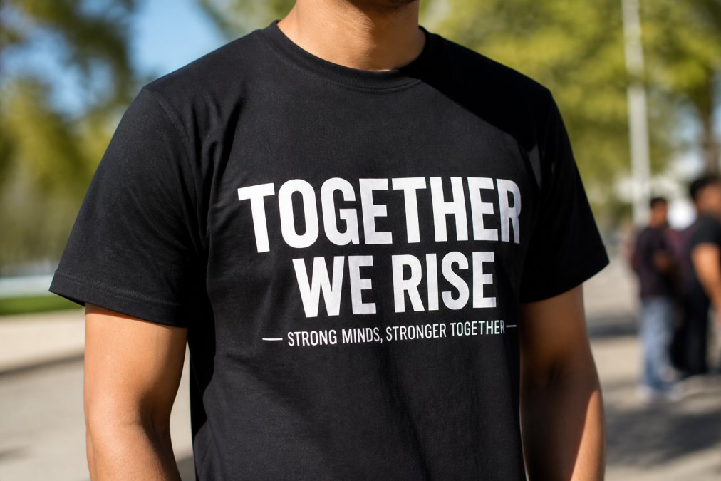
Test your font choices at actual print size before finalizing your design.
Apply Color Theory and Contrast for Maximum Impact
Color is your most powerful tool for creating visual impact and ensuring your design reads clearly from a distance. Understanding contrast and color relationships transforms a mediocre design into one that commands attention.
The most critical principle is contrast. High contrast between your design and the shirt background ensures readability and visual punch. On dark shirts, use light colors like white or cream. On light shirts, use dark colors or saturated tones. This is non-negotiable for professional apparel.
Beyond light-dark contrast, consider color harmony. Complementary colors (opposite on the color wheel) create visual excitement. Analogous colors (adjacent on the color wheel) create cohesion. For professional group shirts, complementary pairs often work best, navy with gold, or gray with teal.
Limit your color palette to 2-4 colors maximum. Your primary color should dominate, a secondary color should support it, and accent colors should highlight specific elements. This restraint separates professional designs from amateur ones.
Saturation matters too. Highly saturated colors demand attention but can feel aggressive. Slightly desaturated colors feel more sophisticated. For corporate teams, muted tones often communicate professionalism better than neon brightness.
Consider how color affects perception. Blue communicates trust and professionalism (peer-reviewed research). Red conveys energy. Green suggests growth. Yellow brings optimism. When selecting your palette, ask whether each color reinforces your group's message.
Free Custom T-Shirt Design Software for Mac 2026
Creating professional group shirts doesn't require expensive design software. Several free options have become powerful enough for most group shirt projects.
Canva remains the most accessible option for non-designers. It offers a free tier with thousands of templates, a drag-and-drop interface, and built-in design elements. For group shirt design, Canva's strength is simplicity, you can create something professional-looking in 30 minutes without prior design experience. The limitation is restricted access to fonts and elements on the free tier.
Inkscape is the free, open-source vector graphics editor that rivals paid alternatives like Adobe Illustrator. It's more powerful than Canva but has a steeper learning curve. If you're comfortable with design software, Inkscape lets you create scalable vector graphics perfect for screen printing.
GIMP is a free raster graphics editor (similar to Photoshop) that works well for photo editing and complex digital designs. If your group shirt design includes photorealistic elements or you're preparing artwork for DTG printing, GIMP gives you professional-grade tools at no cost.
Gravit Designer offers a free web-based version with surprisingly strong features for vector design. It's intuitive enough for beginners but powerful enough for professionals. For designing professional group shirts, Gravit Designer strikes a good balance between accessibility and capability.
The choice depends on your comfort level and design complexity. Start with Canva to test ideas quickly. Graduate to Inkscape or Gravit Designer for more control and better file formats for professional printing.
Custom T-Shirt Design Ideas for Corporate Teams
Corporate team shirts build unity, communicate brand identity, and create a visual signal of belonging. The best designs balance professionalism with personality.
The classic approach is a minimalist logo with company name and tagline. This works because it's professional, scalable, and looks good on multiple garment colors. Keep it simple enough to read from a distance but distinctive enough to be memorable.
A more engaging approach incorporates your company values or mission statement. Instead of just a logo, feature a short phrase that represents your team's purpose. "We Build Better Solutions" or "Driven by Excellence" becomes part of the visual design. This approach works especially well for teams that want their shirts to spark conversations.
Color coordination amplifies team unity. A single company color paired with white or neutral background creates strong visual cohesion. If your company has established brand colors, use them. Consistency reinforces brand identity.
Location-based designs work for distributed teams or regional offices. Feature your city or region alongside your company name. This personalizes the shirt while maintaining company identity.

Seasonal or project-based designs keep team apparel fresh. New designs for each major project or quarter prevent designs from feeling stale and give you opportunities to experiment while maintaining core brand identity.
How to Prepare Artwork for Screen Printing
Screen printing requires specific file formats and technical specifications that differ significantly from digital display. Proper preparation is what separates professional results from disappointment.
Start with vector graphics. Screen printing requires scalable artwork without rasterization or quality loss. Adobe Illustrator is the industry standard, but free alternatives like Inkscape work equally well. Your design should be created as vector paths, not pixels, clean lines, solid colors, no gradients or transparency effects.
Color separation is critical. Screen printing creates one screen per color, so your design needs to be in CMYK color mode (Cyan, Magenta, Yellow, Black), not RGB. Most design software defaults to RGB. You must manually convert to CMYK before submitting.
File format requirements typically specify EPS (Encapsulated PostScript) or PDF. These preserve vector information and are the industry standard. Never submit JPEGs or PNGs for screen printing.
Line weight and detail matter. Thin lines (under 0.5 points) can disappear during printing. Ensure all lines are at least 1 point thick. Small details can also be problematic, if your design includes tiny text or intricate patterns, they may not reproduce clearly.
Transparency and effects don't work in screen printing. Drop shadows, glows, gradients, and transparency effects must be converted to solid colors or removed entirely. For professional group shirts, stick with solid colors for reliability and cost-effectiveness.
Logo Placement, Sizing, and Design Layout
Where you place your logo and how large you make it determines whether your design reads as professional or amateur. Logo placement is governed by practical considerations about how people view the shirt and how the design balances visually.
The most common placement is center chest, positioned roughly where the heart sits. This placement is visible when someone faces you and works well for most group shirt designs. Your logo should be roughly 3-5 inches wide when printed on a standard adult shirt (aiga.org). This makes it clearly visible from a few feet away without overwhelming the shirt.
Left chest placement is another professional option, especially for corporate designs. This mimics polo shirt logos and reads as more formal. Back neck placement is ideal if you want a larger, more dramatic design, 8-12 inches wide. Sleeve placement adds visual interest without requiring front real estate, typically 2-4 inches wide.
Consider the garment color and fabric when sizing your logo. On a dark shirt, a light-colored logo needs to be slightly larger to maintain visibility. Textured or patterned fabrics require slightly larger designs than solid colors.
Spacing and margins matter. Don't place your logo too close to the shirt edge or neckline. Standard practice is at least 1 inch from the edge and 2-3 inches from the neckline. This prevents your design from being obscured when worn or washed.
If you're including text alongside your logo, establish clear visual hierarchy. Your primary logo should be dominant. Supporting text should be noticeably smaller and positioned to complement, not compete with, the logo.
Test your layout at actual size. Print a mockup at the size your design will appear on the shirt and place it against an actual shirt. This reveals spacing issues, sizing problems, and visual balance problems that are invisible on screen.
Designing professional group shirts that spark conversations requires balancing technical precision with creative intention. From defining your group's message to preparing print-ready files, each step builds on the previous one. The difference between a shirt people wear because they have to and one they wear because they want to comes down to thoughtful design choices that reflect your group's identity.
At Totally Terrific Tshirts, we offer custom apparel designed to showcase your group's story with the quality and intentionality it deserves. Whether you're building corporate unity, celebrating community, or expressing shared values, we provide the platform and expertise to bring your vision to life. With free shipping on orders over $75 and support for both small groups and large bulk orders, you can create meaningful apparel without compromise.
Frequently Asked Questions
What file formats are required for professional screen printing?
Screen printing requires vector graphics in formats like AI, EPS, or PDF for best results. Vector files scale without quality loss and ensure crisp ink application. Avoid JPG or PNG unless converting to vector first. Work in CMYK color mode, not RGB, to match how inks will print. High-resolution artwork (300 DPI minimum) prevents pixelation. Submit print-ready files with proper bleeds and separations for each color layer.
How do you make a group t-shirt design look professional rather than cheap?
Focus on visual hierarchy, restraint, and quality execution. Use 2-3 colors maximum instead of cramming every color into the design. Choose professional fonts, avoid Comic Sans or overly decorative typefaces. Ensure sufficient contrast between design and garment color. Position your logo and text strategically using sizing guidelines that prevent overcrowding. Select quality garment fabric (heavier weight feels more substantial). Test your design mockup before production to catch issues early.
What are the most common mistakes when designing custom group shirts?
Poor contrast makes designs hard to read on colored shirts. Using RGB instead of CMYK causes color mismatch at print. Placing designs too close to seams or edges causes cutoff. Overly complex artwork doesn't translate well to printing. Ignoring the garment's fabric weight and color when designing leads to disappointment. Submitting low-resolution files creates pixelation. Failing to consider how the design looks at actual size instead of just on screen prevents discovering legibility issues before production.
Can AI tools assist in creating professional t-shirt designs?
Yes, AI tools can generate design concepts and mockups quickly, but they require human refinement. Use AI for brainstorming color palettes, layout suggestions, or generating initial design directions. However, AI-generated designs often lack the polish and brand identity alignment that professional designs need. The best approach combines AI inspiration with manual design work using professional software like Adobe Illustrator. Always vectorize final artwork and adjust colors for your chosen printing method before submitting to production.
This article was written using GrandRanker