

Table of Contents
- Why Some Shirts Spark Conversations and Others Get Ignored
- Design Principles for Non-Designers: Typography, Color, and Print Placement
- Best Graphic Design Tools for T-Shirts: From Free to Pro
- Tips for Designing Funny T-Shirts That Actually Land
- How to Create Jewish Themed Graphic Tees That Invite Questions
- Technical Design Specifications: File Setup, Print Methods, and Fabric Choice
- From Screen to Street: Testing Your Conversation Shirts Before You Print
- Frequently Asked Questions
Last Updated: October 3, 2026
Why Some Shirts Spark Conversations and Others Get Ignored
Learning how to design shirts that start conversations begins with one truth: a graphic tee works as an icebreaker when it gives a stranger something easy to say. If you want to know how to design shirts that start conversations, the answer is simple: the design has to do one clear job in about two seconds.
The shirts that get stopped in the grocery store aisle are never the busiest ones.
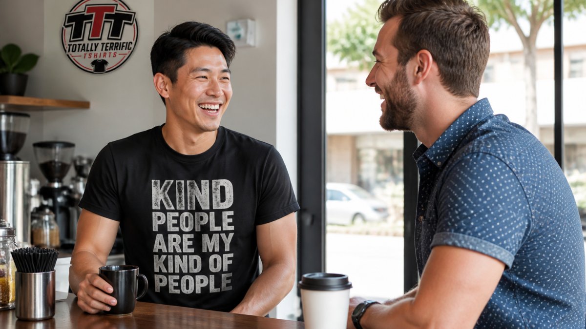
The Psychology Behind a Good Icebreaker Shirt
A shirt becomes a conversation starter because it lowers the social cost of speaking first. A stranger can comment on your shirt instead of on you, which feels safer for both people. Someone reads your shirt, smiles, and says, "Okay, I need to know where you got that." That is a low-risk opening, and your shirt did the hard part. This is why vague designs fail: a pretty abstract pattern gives nobody a way in, but words give people a script.
Design Principles for Non-Designers: Typography, Color, and Print Placement
You do not need design training to make a shirt people talk about. You need three decisions made well: the font, the colors, and where the print sits on the body.
Start with typography. Pick one font and make it big. Mixing three fonts because each looks nice on its own just turns into noise.
Color does the heavy lifting for attention. High contrast between text and shirt color makes people look twice.
Print placement decides how the shirt wears. A full front print is loud and proud, while a small left-chest print is subtle and works better for work settings.
Legibility and Visual Hierarchy That Make People Look Twice
Legibility means people can read it fast. Visual hierarchy means they know what to read first. A simple order that works:
- One main line, biggest font, carries the joke or message
- One support line, smaller, adds context
- Optional small graphic that ties the two together
Keep the main line under eight words. Long sentences get squinted at, then ignored.
Best Graphic Design Tools for T-Shirts: From Free to Pro
The best graphic design tools for t-shirts split into three tiers, and most people only need the first one. But the tool matters less than the settings you use inside it, that is what decides whether your shirt reads clearly from across a room.
For quick text-based designs, free browser tools like Canva cover fonts, colors, and layout without any learning curve. For more control over spacing and vector shapes, Inkscape is free and built for print files.
| Tool | Cost | Best For | Skill Level |
|---|---|---|---|
| Canva | Free tier | Text-based tees | Beginner |
| Inkscape | Free | Vector print files | Intermediate |
| Affinity Designer | One-time purchase | Budget pro work | Intermediate |
| Adobe Illustrator | Subscription | Full print production | Advanced |
Whatever you choose, export a high-resolution file. Blurry art prints blurry. We see this constantly with customer uploads, and it is the easiest problem to avoid.
The Settings That Actually Decide Whether Your Design Reads
Here is where non-designers get tripped up.
Work at 300 DPI at final size. That is the print industry baseline for sharp edges.
Pick fonts with thick strokes. Thin, delicate script fonts look elegant on a screen and disappear on cotton.
Check contrast, not just color. Convert your design to grayscale: if the text still pops, your contrast is strong enough.
Leave a margin. Keep text at least half an inch from the edge of your print area so nothing gets clipped when the shirt is pressed.
A Simple Workflow for Non-Designers
- Open a free tool and set your canvas to 12 by 14 inches at 300 DPI.
- Type your main line in one bold font, sized to fill about 70 percent of the width.
- Add a smaller support line underneath if you need context.
- Switch to grayscale and check that the text still stands out.
- Export as a PNG with a transparent background.
That is the whole process. The shirts that get stopped in the grocery store aisle are never the busiest ones, and they are never the ones with five fonts fighting for attention. They are the ones where one clear message lands in about two seconds.
If you would rather skip the file setup entirely, our team at Totally Terrific Tshirts handles the print-ready details for you. Whether you are shopping for nurses, teachers, seniors, or funny fun t-shirts, every design is made to spark real exchanges.
Tips for Designing Funny T-Shirts That Actually Land
Funny shirts land when the joke is short, specific, and readable from a few feet away. Broad humor dies on fabric.
The best tips for designing funny t-shirts come down to timing and audience. A joke aimed at nurses, teachers, or retired folks works because those groups share an inside language, while a generic joke about Mondays does not.
Keep the punchline in the biggest font, put the setup in smaller text above or below it, and read it out loud before you order. If you stumble saying it, strangers will too.
Some categories that consistently get comments:
- Nurse and teacher humor built on real shift stories
- Senior and retired jokes that celebrate the age instead of mocking it
- Country music references that fans instantly recognize
- Faith-based humor that stays warm rather than preachy
How to Create Jewish Themed Graphic Tees That Invite Questions
The best Jewish themed graphic tees invite questions by using symbols and phrases that feel familiar to some people and curious to others. That gap is exactly where conversation starts.
Ask me about Tactical Civics with QR code front and back →
Think about a shirt with a Hebrew word, a holiday reference, or a line of blessing. Someone who knows it smiles and says something. Someone who does not asks what it means. Both reactions are wins.
A few practical choices help:
- Pair Hebrew text with a small English translation so the shirt explains itself
- Use symbols like a menorah, a star, or a pomegranate as a simple visual anchor
- Keep holiday shirts tied to one holiday so the message stays clear
Design Mechanics That Make Faith-Based Shirts Readable
The symbols matter, but the layout is what makes a stranger stop and ask.
Give the Hebrew room to breathe. Hebrew reads right to left, and vowel marks (nikkud) add small strokes above and below the letters.
Stack, do not crowd. Hebrew phrase on top, English translation directly underneath in a smaller font, and a single symbol anchoring the corner.
Choose symbols with instant recognition. A menorah, a mezuzah, a Star of David, or a pomegranate all read at a glance.
Keep the tone warm. Faith-based humor lands when it celebrates rather than mocks.
The same approach works for Christian, patriotic, and faith-driven designs. Our guidance on religious expression in public life from Pew Research Center shows how common public displays of faith identity are, which is why these shirts start so many friendly exchanges.
If you want a starting point, our I'm going to let God fix it because if I fix it, I'm going to jail tee is a good example of a message that gets a laugh and a follow-up question in the same breath. And if you are shopping for Jewish, Christian, or patriotic designs, our collections are built to spark exactly these kinds of warm, curious exchanges.

Technical Design Specifications: File Setup, Print Methods, and Fabric Choice
Technical specs decide whether your design looks sharp or washed out, and most guides skip this part entirely.
Direct-to-garment (DTG) printing sprays ink directly onto the fabric. It handles detailed art and small runs well, which makes it the right fit for custom orders of just a few shirts.
Screen printing pushes ink through a mesh screen. It delivers bold, long-lasting color and makes sense for larger group orders like team or event shirts.
Fabric choice changes how the print feels.
| Spec | What to Use | Why It Matters |
|---|---|---|
| Resolution | 300 DPI at print size | Prevents blurry edges |
| File type | PNG or vector | Keeps art clean |
| Print method | DTG for small runs | Better detail on low counts |
| Fabric | Ring-spun cotton | Soft, print-friendly surface |
Our own tees use a soft, print-friendly fabric with a double-needle collar and a tear-away label, which keeps the neckline smooth and comfortable for all-day wear.
From Screen to Street: Testing Your Conversation Shirts Before You Print
Test before you print, because a design that looks great on a monitor can fall flat on a body.
A few things to check on the sample:
- Can people read it from six feet away?
- Does the fit match the size chart, or does it run small?
On fit, our size guide runs from S to 3XL with a half-chest range of about 18 to 28 inches, so measure a shirt you already love and match it to the chart.
We also keep minimums low, so you can order for your friend group without buying a case you will never wear.
Designing a shirt that starts conversations is really about giving other people an easy way to talk to you.
Totally Terrific Tshirts builds every design as a canvas for your story, with messages made to spark real exchanges, low order minimums for small groups, and free shipping on orders over $75. Whether you are shopping for nurses, seniors, teachers, country music lovers, or funny fun t-shirts, we have a design ready to wear. Get started with Totally Terrific Tshirts at totallyterrifictshirts.com and wear something worth talking about.
Frequently Asked Questions
What makes a t-shirt design a good conversation starter?
A good conversation shirt combines three things: a clear message people can read in under three seconds, a topic broad enough that strangers feel invited to respond, and a visual style that matches your personality. Typography matters more than artwork here. Bold, legible text at chest height gives people something specific to react to, whether it is a question, a joke, or a statement of values. Shirts that try to say too much at once usually get ignored because nobody can process the message fast enough to comment on it.
Can I design conversation shirts without any graphic design experience?
Yes. Free tools like Canva offer t-shirt templates sized for standard print areas, so you can drag text and graphics into place without learning professional software. Start with one strong phrase, pick two fonts at most, and keep your design inside a 12-inch by 16-inch print zone on the front. If you would rather skip the software entirely, Totally Terrific Tshirts offers ready-made designs across categories like patriotic, faith-based, and funny fun tshirts that already do the conversation work for you.
How do I make sure my custom shirt design does not look amateur?
Three habits separate polished designs from amateur ones. First, limit your color palette to two or three colors that contrast with the shirt fabric. Second, give your text breathing room: at least half an inch of empty space around the edges of your print area. Third, check legibility by shrinking your design to the size of a business card on your screen. If you cannot read it at that size, it will be unreadable from across a room. These small adjustments make a bigger difference than fancy graphics.
What print methods work best for text-heavy conversation shirts?
Direct-to-garment (DTG) printing handles detailed text and small lettering well because it prints digitally without setup costs. For fabric, ring-spun cotton gives a soft print surface.